

Time’s up for Active Content in your Custom eBay Store Design


Over the years, eBay has become one of the largest online marketplaces, and has undergone major changes front-end and back-end. This includes any custom eBay store design, as the site is now more structured in how it displays products. So what does this all mean for eBay sellers?
What's the deal with active content on eBay?
Just in case you’re not aware, eBay has come down hard on ‘active content.’ Now I hear you say, what is active content?
Active content can refer to Javascript, Flash plugins, forms and widgets. eBay’s policy change came into effect in June 2017, and the marketplace will now message to inform you if it finds active content in your eBay store design. If the issue isn’t rectified, the seller will have a broken listing template resulting in a drop in conversions - in other words, a drop in sales. Here is more than one eBay seller discussing the effects of active content.
This forum shares individual experiences of eBay sellers, and naturally circumstances differ. However, there's a mention of listings not looking correct on mobile, and this will almost certainly be active content in action.
Chris Dawson, the editor and founder of Tamebay, recently released an article which mentioned that one unfortunate eBay seller reported a 22% drop in sales on one particular product. Ouch! Just reading “22% drop in sales” nearly had me falling off my chair, and all because a widget was embedded on the product listing to gather personalised information.
It doesn't bear thinking of the impact this would have had if the widget was on ALL listings. The 22% figure would have almost certainly increased sharply, depending on the number of items that were listed on the store.
So it’s very important that any active content is completely removed. Speak to eBay customer support if there is something specific you want to do. and find out whether this is achievable or not & within the eBay guidelines.
Why has eBay turned against active content?
Now you might ask, why would eBay ban active content if it makes the store look all fancy and interesting? The main reasons behind this policy are security and performance.
eBay wants to ensure the marketplace is as safe as possible. You don’t want to be accessing eBay listings with malicious Javascript being injected and altering the data on the page. Malicious scripts could also redirect users to another website that may contain malware or adware, resulting in viruses plaguing their machine. Taking this risk away ensures your customers can access the required information without worrying about any of this.
Another security risk was caused by the use of iFrames. An iFrame is a HTML document embedded inside another HTML document and used to show content from another source. I think it would be difficult for eBay to verify every iFrame being used and the content that's displayed, so the safest and best option was to simply remove this functionality. No iframes, no problems, no malware, no cross frame scripting.
Now, in regards to performance, eBay wants to enhance the mobile experience for customers. After all, most online shopping today is done using through devices. For this reason, you need to consider load times for mobiles. For instance, huge images will take a long time to load and may eat up the website visitor’s data, resulting in them getting bored and navigating away from the store.
How to check for active content in your eBay store design
If you’d like to check for active content in your eBay store design, then this simple tool will allow you to do just that. Simply paste in the item number and click ‘check now’ to see the results. Most active content can be replaced so long as it doesn’t require the use of Javascript.
For example, HTML/CSS3 can be used to create scrolling banners and galleries. This fits within the eBay guidelines and loading times are quicker too.You can also use third party listing tools to get listings up on eBay that are active content friendly, but you won’t have the same freedoms on what you can display.
Your custom eBay store design can still stand out
eBay has its own look and structure for a storefront. Take a look at the storefront for Brownies Bike Spares Ltd. You can see it has the look of Facebook or Twitter, with the large image going across the top, and the profile image below with the store name.
Not the best looking store design is it? Don’t worry - you're not restricted to this layout.
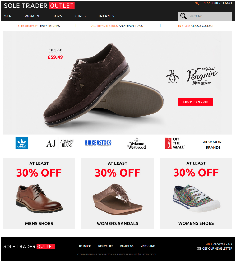
The most recent store design we’ve done is Soletrader Outlet.

You can see the benefits of having a custom eBay store design. It’s possible to add in scrolling banners and link them to products or shop categories, for instance. This is something the ‘default’ eBay storefront doesn’t allow you to do.
It doesn't have the categories down the left hand side, nor does it have a list of all the products you have on the store. It’s best to keep storefronts to a minimum, as you don’t want to overload the storefront and put off the customer.
As a result, you can keep to brand guidelines and mirror your existing eCommerce website, which is something this client was keen on.
eBay has started phasing out custom eBay store design since the start of the year. However, this only applies to new customers that have opened stores on eBay, for old customers, this is still in place. We don’t know what eBay plan on introducing once custom eBay store design has been completely removed as an option, but we can’t wait to find out.
eBay store listings still matter
It’s really important to have a listing template free from active content - otherwise you’ll end up with a broken template.
Product descriptions play a crucial part on your listing template, as this where you can really sell the product by listing its key features and incorporating keywords. However, product descriptions are slowly becoming less visible on eBay. If you use the mobile app, you will see that this has been replaced with a button, and this is also happening on desktop.
You could argue, why have the product descriptions at all if they are hidden? Well, less product descriptions will result in less sales. With descriptions set as a required field, eBay will not list items on your store without them.
If you take a look at this Soletrader Outlet product listing, it’s a clean design with easily accessible information and promotions at the bottom of the listing template. This is another way to increase sales, yet another benefit to having a custom eBay store design. The gallery has been created using HTML and CSS3, but doesn't look any different to when galleries were inserted using Javascript.
Any images or stylesheets loaded in are also served over HTTPS://, as per eBay's requirements.
To summarise, deciding whether to have custom eBay store design is something to think about. It’s not something everyone needs, and it is still possible to use the tools that eBay provides you to see good success.
If you’d like to get an expert opinion on your custom eBay store design or discuss your customised options, why not book a quick call with our team and we can talk you through it.


